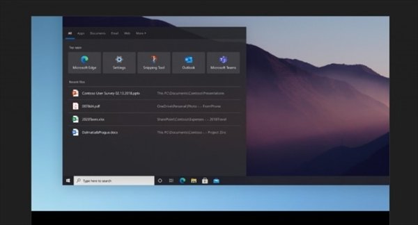
According to the latest report from foreign media, Microsoft is carrying out a comprehensive reform of the Windows 10 graphical interface.
From the details of the exposure, the UI update was found on the pop-up window released on Microsoft’s Tips application. This is a very subtle update.
The redesigned “Settings” application uses new icons based on Microsoft’s Fluent Design language.
In addition, compared with the current design, the new design looks more dull.
In the design simulation diagram based on this style, the “Settings” application has been subtly adjusted with rounded edges, but these changes are enough to make Windows 10 more modern and attractive, and more in line with Microsoft’s new WinUI and Fluent Design style.
Some sources said that although it is still not finalized, but at least these images at least let us get a close look at the ideas being considered within Microsoft.
A screenshot of the translucent Windows search interface


